Colour Psychology in Exhibition Design: What Really Works
Walk into any exhibition hall and one thing stands out immediately — colour. Some stands pulse with bold reds and electrifying blues, while others invite you in with calm neutrals or sophisticated metallics. None of this is accidental. Colour is one of the most powerful tools in marketing and exhibition design — a silent language that influences how people feel, react, and remember your brand.
In this article, we’ll explore colour psychology in marketing and exhibition design — how it shapes brand perception, drives engagement, and even affects buying behaviour. Whether you’re a marketing strategist or an exhibition stand designer, understanding how colour works can transform your next project from good to unforgettable.
Why Colours Matter in Marketing and Exhibitions
Colour isn’t just visual — it’s emotional. It’s often the first thing people notice about your brand, even before they read a word. In crowded trade shows, where exhibitors are competing for attention, colour becomes your loudest ambassador.
In visual marketing, colour can communicate energy, trust, innovation, or luxury — instantly. When used strategically, it can attract visitors, guide attention, and reinforce your message without saying a word. That’s why many experts call colour “the shortcut to brand perception.”
At exhibitions, where decision-making happens in seconds, choosing the right palette can determine whether a visitor walks past — or walks in.
The Science of Colour Psychology
Colour affects the human brain on both conscious and subconscious levels. Studies in colour psychology marketing show that people make snap judgements about products and brands within the first 90 seconds of seeing them — and up to 90% of that judgement is based on colour alone.
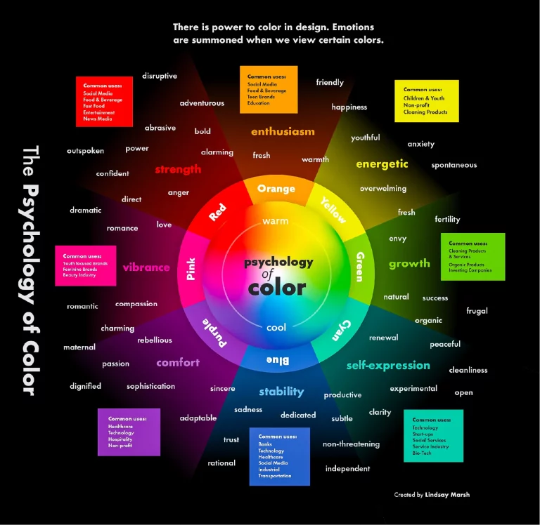
Different hues trigger different emotional responses. Here’s a quick overview of how colour meaning in marketing typically plays out:
- Red: Passion, urgency, excitement. Great for energy, limited offers, or food brands.
- Blue: Trust, calm, intelligence. Commonly used in finance, tech, and healthcare.
- Yellow: Optimism, friendliness, creativity. Ideal for youthful, energetic brands.
- Green: Growth, balance, sustainability. Perfect for eco-friendly or wellness industries.
- Black: Luxury, power, sophistication. Used by high-end fashion and automotive brands.
- White: Simplicity, cleanliness, clarity. Effective for minimalist, modern aesthetics.
Understanding how colour affects customer behaviour helps marketers and designers choose palettes that evoke specific reactions — whether it’s excitement, trust, curiosity, or calm. At trade shows, where visual overload is common, this psychological insight is your competitive edge.
Colour and Brand Identity: Building Trust Through Design
Your brand colours aren’t just decoration — they’re part of your identity. Every major brand carefully chooses its palette to reflect values and tone. This is known as brand colours psychology, and it’s a cornerstone of consistent, recognisable marketing.
Think of Coca-Cola — bold, red, energetic. IBM — deep blue, stable, reliable. Spotify — vibrant green, creative, youthful. These colours aren’t random; they’re strategically selected to align with what the brand stands for and how it wants to make people feel.
In exhibition design psychology, this is even more crucial. Your stand must instantly reflect your brand’s personality. If you’re a tech company, crisp whites and cool blues can communicate innovation and trust. If you’re a lifestyle or wellness brand, earthy tones and greens may create a sense of calm and authenticity.
Consistency is key — when visitors see the same colours across your stand, marketing materials, and website, it builds trust and recognition faster.
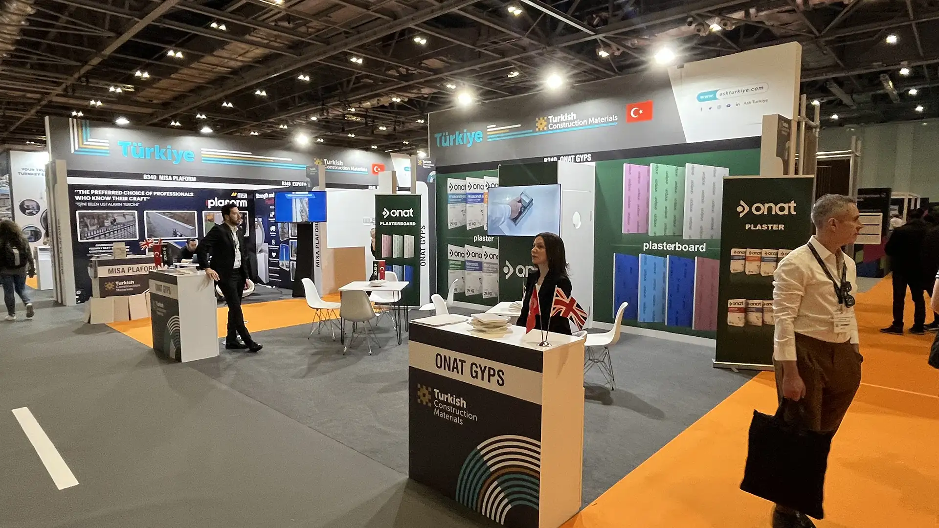
Colour Choices for Exhibition Stands: What Works Best for Engagement
So what are the best colours for exhibition stands? The answer depends on your brand goals and the kind of emotions you want to evoke. But here are some guiding principles that consistently deliver strong results:
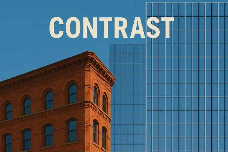
1. Use Contrast to Catch Attention
High-contrast colour schemes — like white and red, or black and yellow — help your stand stand out in a sea of muted tones. Contrast draws the eye and helps important messages, logos, and call-to-action points pop.
2. Align Colour with Purpose
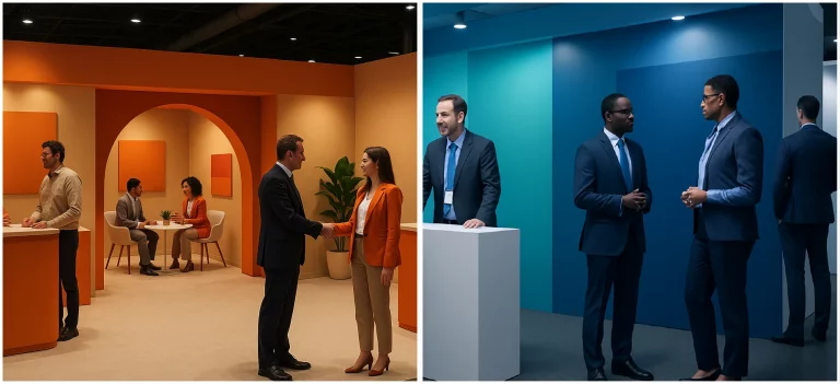
If your goal is to attract visitors with colour, think about your audience. Are they corporate professionals, creatives, or families? Use colours that resonate emotionally with their expectations. For example, bright tones for innovation sectors, or deep, reassuring hues for B2B industries.
3. Balance Energy and Comfort
Bold colours grab attention but can become tiring if overused. Combine them with neutral backgrounds or softer tones to maintain balance and visual comfort throughout the day.
4. Consider Lighting and Material
Lighting affects colour perception dramatically. A glossy red under warm lighting might appear orange, while a cool blue can look grey under harsh spotlights. Always test colour samples under real lighting conditions to ensure consistency in your final exhibition stand design.
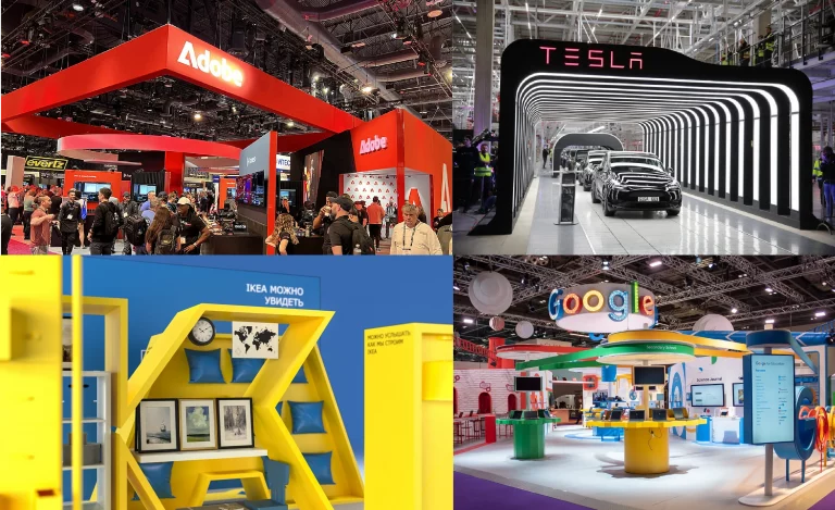
Real-World Examples: Global Brands Using Colour Effectively
Let’s look at how major brands use colour psychology marketing in real-life exhibition settings:
- Adobe — Uses strong reds and greys to project energy and creativity while maintaining professionalism. Their exhibition stands often use dynamic lighting to make these colours come alive.
- Tesla — Balances white minimalism with deep red accents, symbolising innovation and boldness. Their stands feel both futuristic and clean, reflecting the brand’s precision.
- IKEA — The blue and yellow combination communicates friendliness and accessibility. Their bright, open stands feel welcoming and authentic — perfectly aligned with their brand mission.
- Google — Multicoloured branding reflects creativity and playfulness. At trade shows, they often use interactive screens and bold graphics to enhance the emotional connection.
These examples prove that trade show branding tips don’t need to reinvent the wheel — they just need to use colour intentionally. Every hue tells a story.
Practical Tips: Choosing the Right Palette for Your Next Stand
Ready to apply colour psychology marketing to your own project? Here are practical ways to bring these ideas to life:
- Start with your brand message: What do you want visitors to feel — trust, excitement, innovation? Build your palette around that emotion.
- Limit your palette: Stick to three to four core colours to avoid visual clutter. Let one dominant tone lead the story.
- Plan your journey: Use brighter tones at entrances and focal points, and calmer colours in meeting or lounge areas.
- Think long-term: Choose colours that can adapt to future exhibition stand design layouts or marketing materials.
- Test, don’t guess: Print samples, test under venue lighting, and get feedback from team members before finalising.
Remember: great exhibition design isn’t just about creativity — it’s about clarity. Visitors should feel something the moment they see your stand, even before they know why.
Colour as Strategy, Not Decoration
Colour is more than just aesthetics — it’s psychology, communication, and brand strategy rolled into one. In exhibition design psychology, it becomes the emotional heartbeat of your space. The right hues can increase engagement, build trust, and create a memorable connection long after the show ends.
So, when planning your next exhibition, don’t treat colour as an afterthought. Treat it as a language. Speak it fluently, and your brand will not only stand out — it will stand apart.
Looking to bring your brand to life through design and colour? Contact our team at DAMA Exhibitions to create an exhibition stand that not only looks incredible — but feels exactly right.